Spatial Experience
I collaborated with an Oakland-based non-profit to enhance the visitor experience for stakeholders at their new farm space in West Oakland.
Background
During our graduate program, we had to opportunity to partner with a local non profit organization, Acta Non Verba (ANV), a youth urban farm project whose mission is to elevate life for youth and their families in Oakland and beyond by challenging oppressive dynamics and environments through urban farming and access to the natural environment.
We were working with their newly acquired 1.4 acre farm space in West Oakland, focused on improving the spatial experience of the place for its visitors
Figma, Photoshop, Illustrator
Challenge
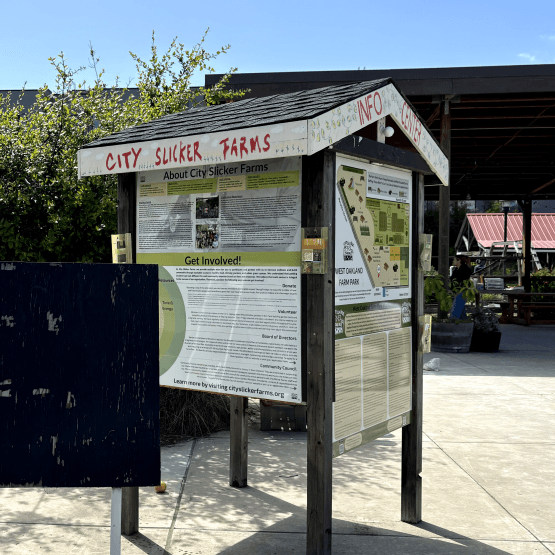
Acta Non Verba's newly acquired West Oakland Farm Park lacks wayfinding and educational resources to help visitors navigate the farm and learn about the various crop species grown there. The goal of this project was to introduce proper navigation, provide educational tools, and foster greater community participation.
Outcomes
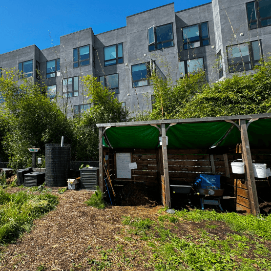
We collaborated on the design and implementation of a new wayfinding system to help both visitors and farm staff navigate the space more easily. Additionally, we provided informational card templates to educate visitors about the crop species and created an instructional guide to foster community engagement with the farm, specifically the compost pile and how to segregate waste for the compost pile.
Clear
Modular
Increased
Community Participation
Our Design Process
RESEARCH & ANALYSIS
01
We conducted thorough research, field visits, interviews, and observational studies to uncover key challenges in the West Oakland Farm Park experience.
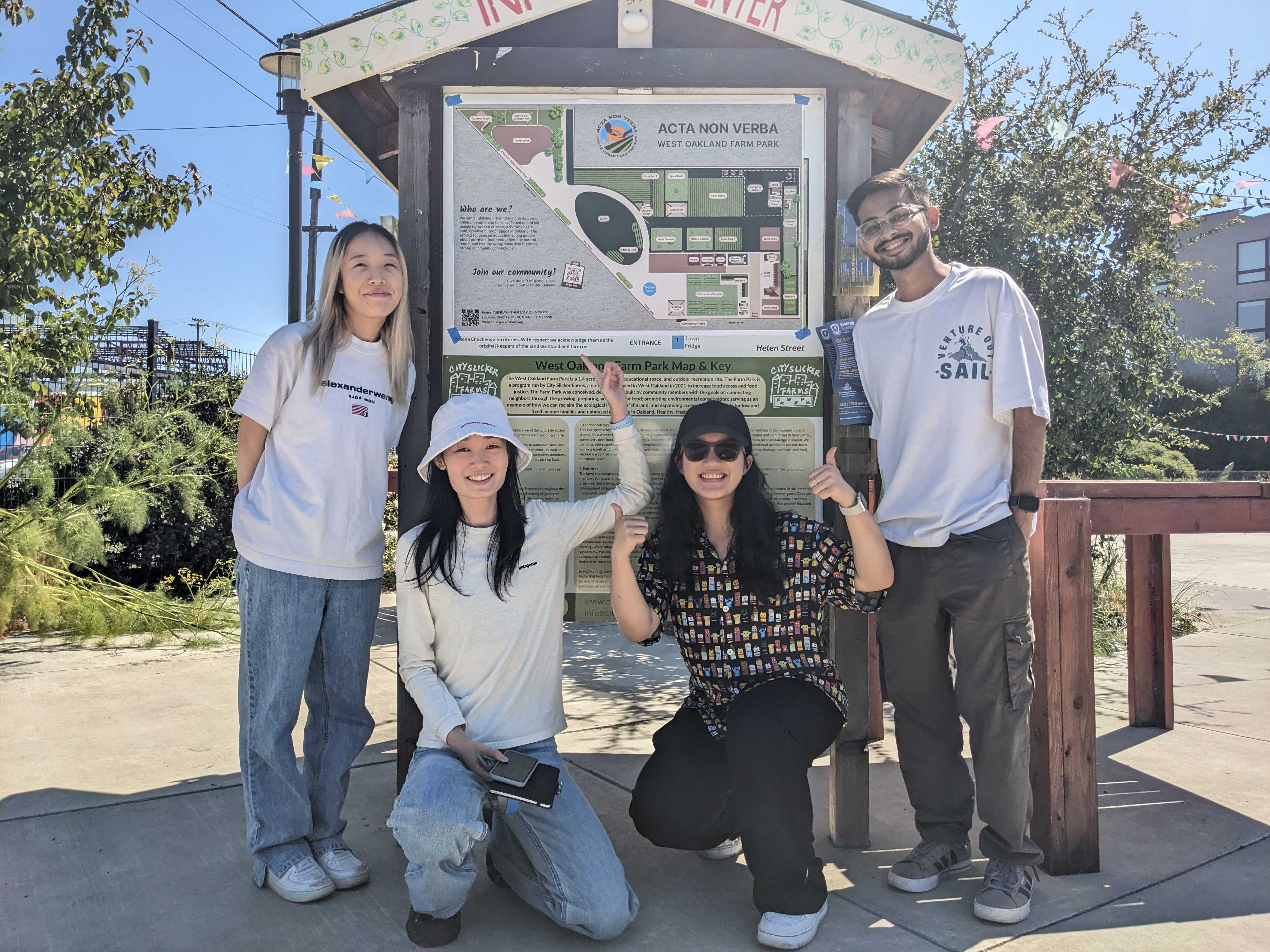
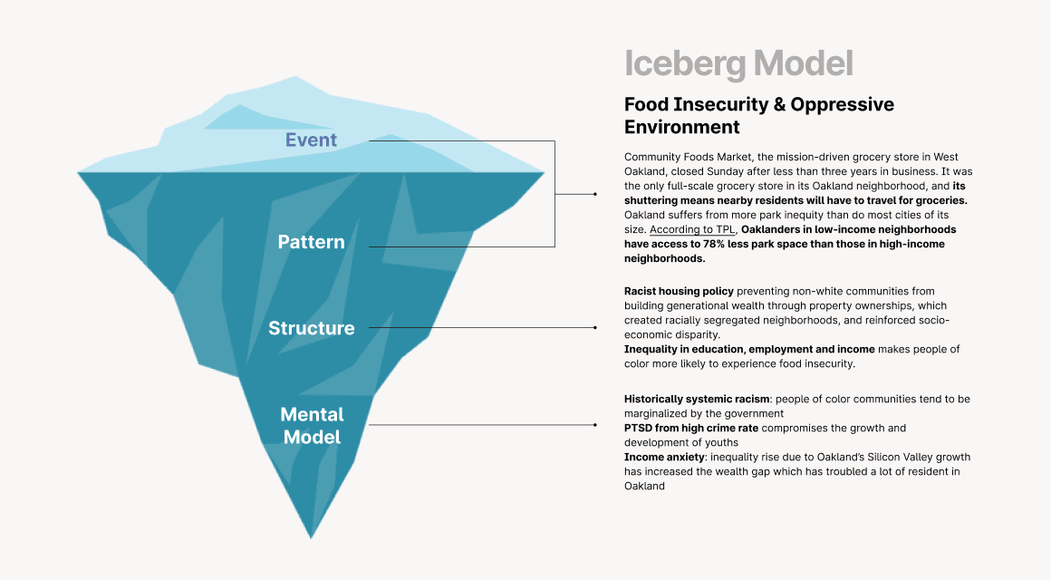
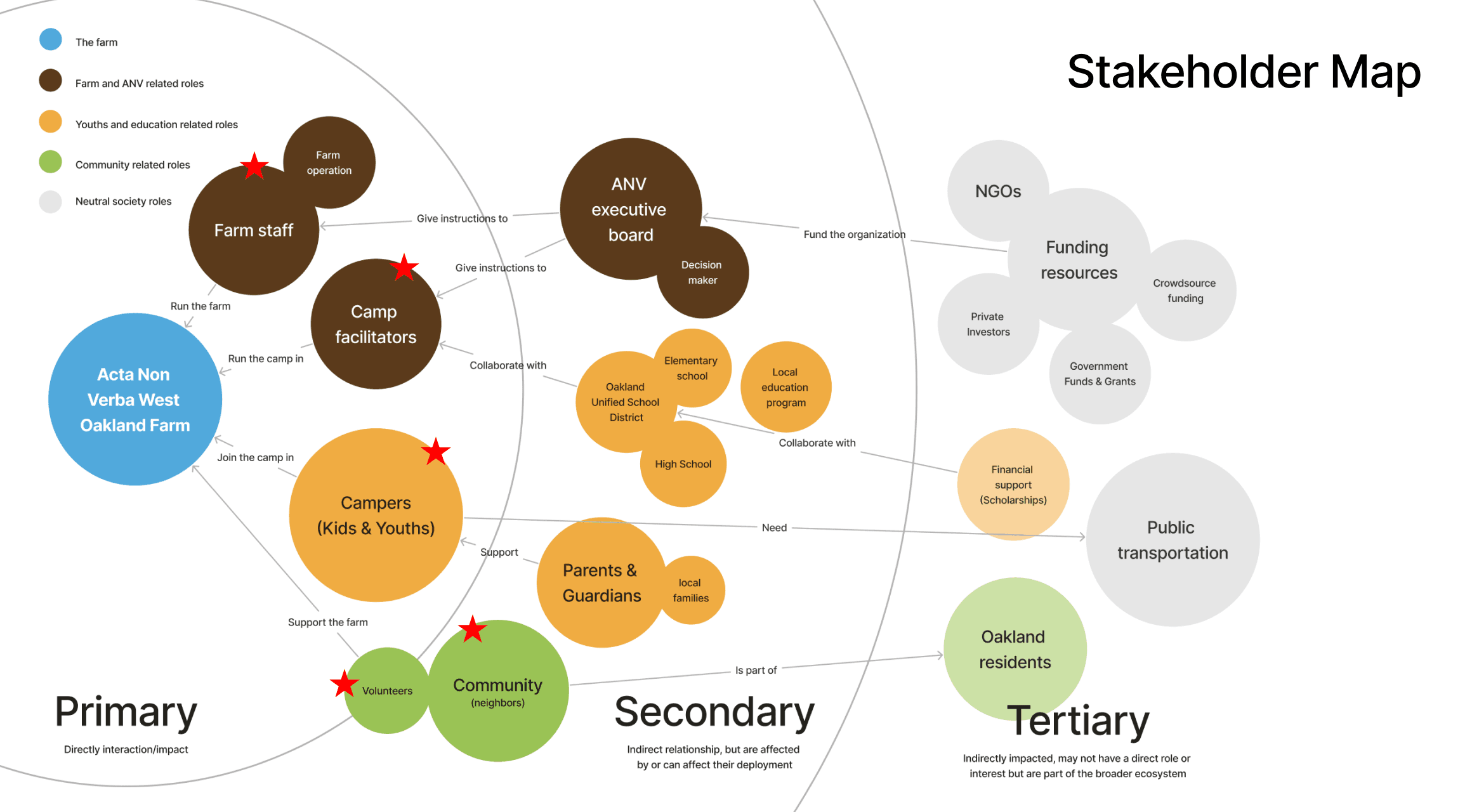
In the first two months of working with Acta Non Verba (ANV), we conducted in-depth secondary research to understand how the organization functions and who the key stakeholders are, using an iceberg model & stakeholder mapping. To get a better sense of the West Oakland Farm Park, we interviewed the staff, volunteers, and community members to identify gaps in their current farm experience, and what all is required to elevate it.
After speaking to the farm staff and other farm visitors,
we narrowed down to three key challenges from our
research findings
Through in-depth user interviews and observational studies at the farm, we identified three key pain points that required attention to make the experience more intuitive and engaging for visitors. These visitors range from young children (0-13 years) to adults of all ages, highlighting the need for a diverse and inclusive design approach.
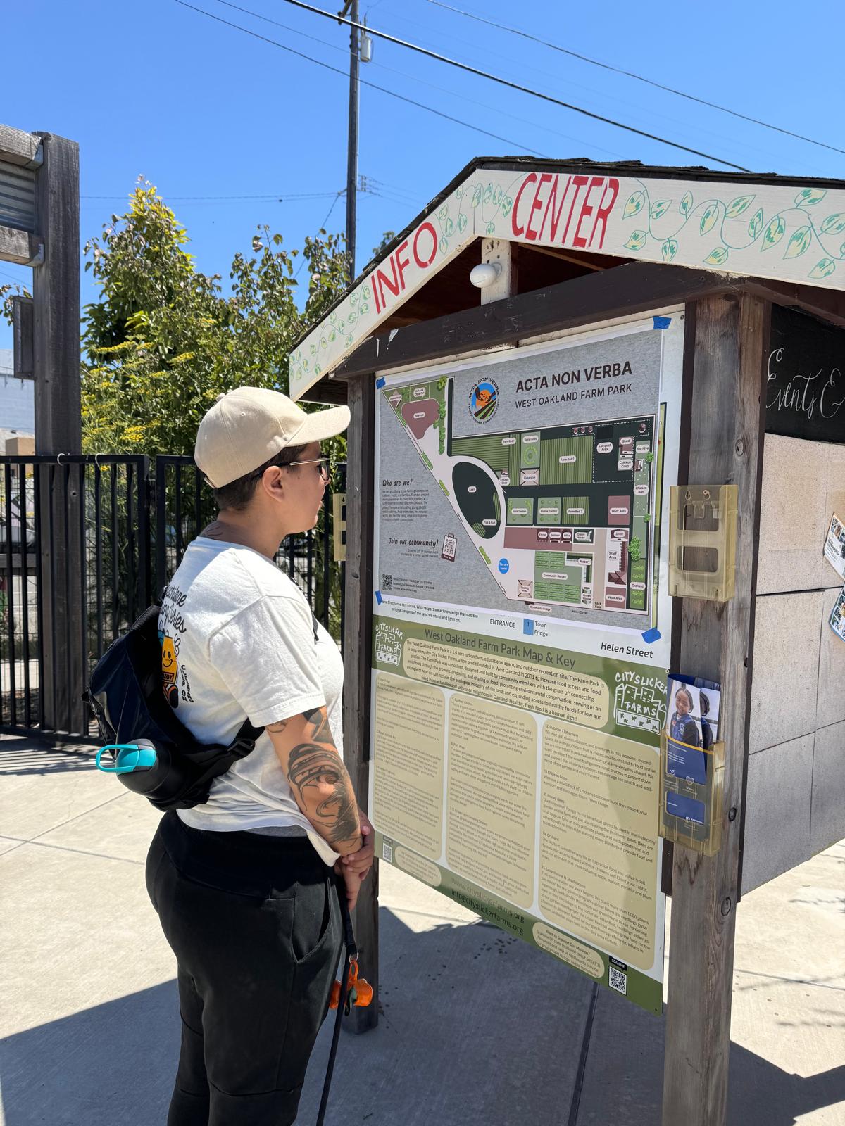
Farm staff and visitors need clear signage and wayfinding tools to make better use of the space. Right now, there are no proper guides, which leaves visitors confused about how to navigate the farm. The only map available is outdated and hasn’t been updated in years

While kids enjoy the farm space, more educational resources are needed to enhance their self-guided camp experience. Currently, there are no learning materials for visitors, especially children, to learn about urban farming during their time at the farm.

The organization faces challenges in fostering community engagement at the farm. Visitors struggle to interact effectively with urban farming activities, such as the compost pile, limiting their overall experience.
PROBLEM STATEMENT
02
How might we
SOLUTION
03

Wayfinding
Created a comprehensive wayfinding system to help visitors to easily self orient themselves to the farm park
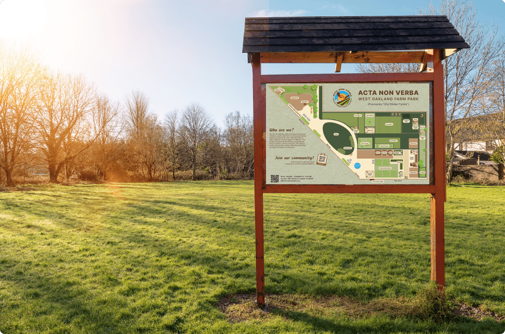
Wayfinding Farm Map
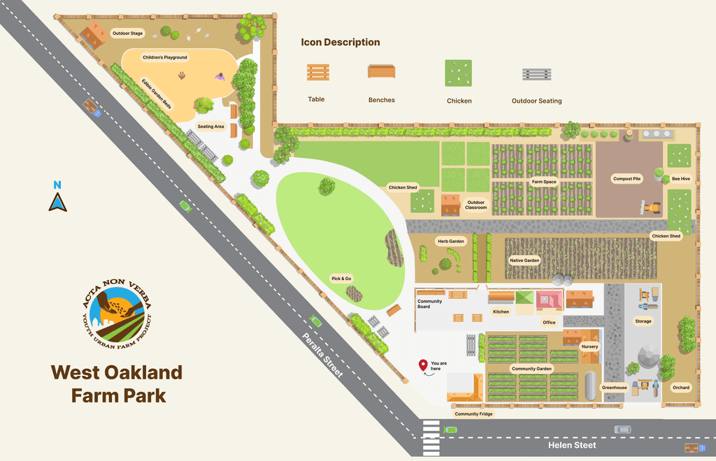
Created a brand new navigational map of the farm which was placed right at the entrance for the best visibility. We updated the map with accurate details. We focused on the simple design which could be understood by visitors of various ages.
Directional Signage
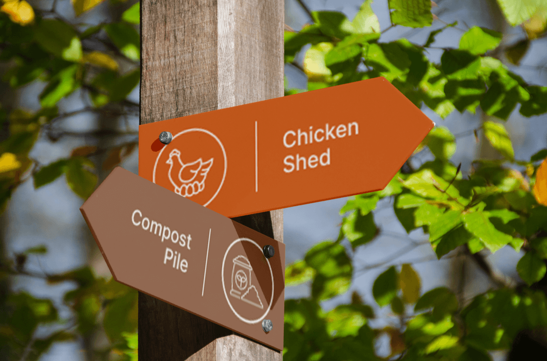
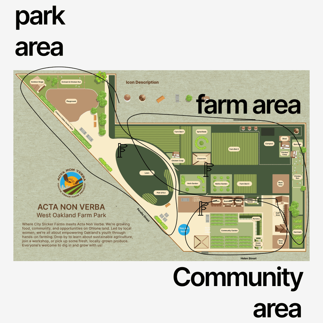
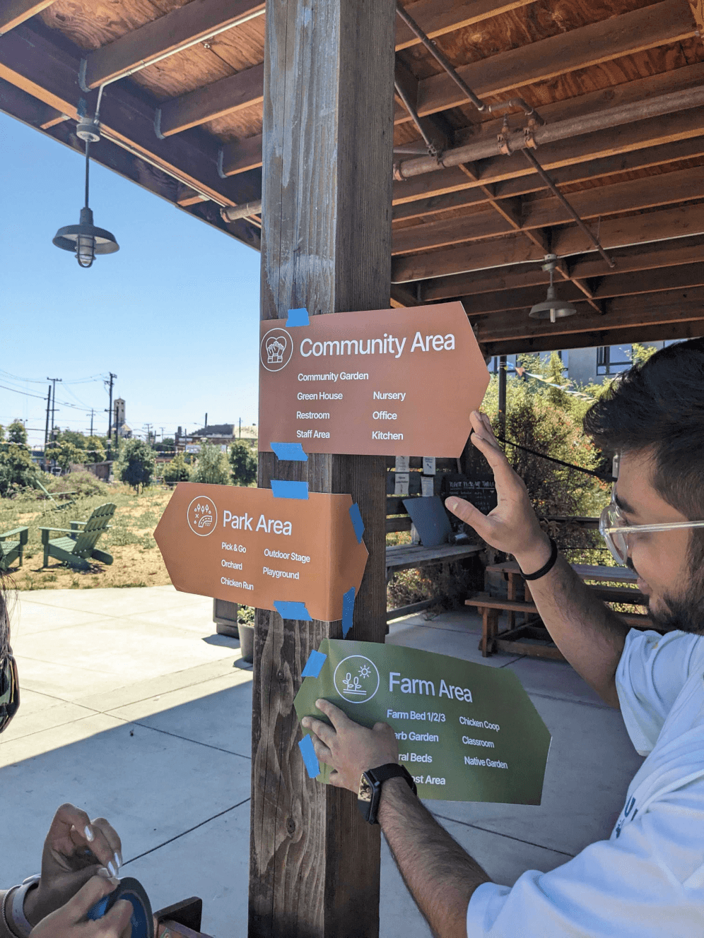
Finding your way in a 1.4 acre space is difficult just with one main wayfinding map, hence to enhance the experience we installed directional signs at selected spots for the users to seamlessly find their desired destinations without any help

Learning
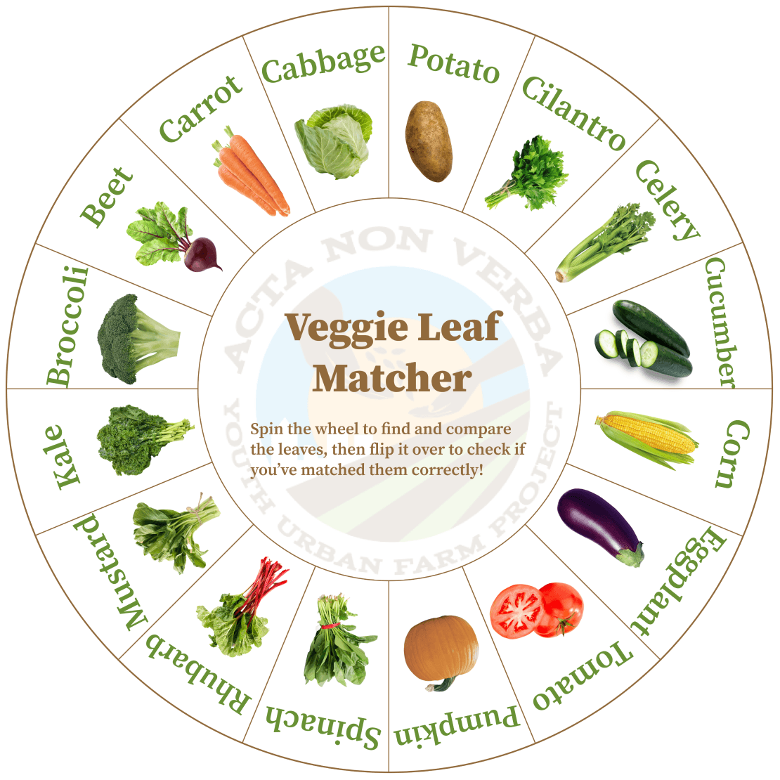
Designed species information cards to help visitors, especially kids, learn about urban farming and its practices.
Specie Information Card
The farm lacks information on crops, and other urban farming processes leaving visitors dependent on staff. To address this, we created species information cards for independent learning.
Template & How to use Guide
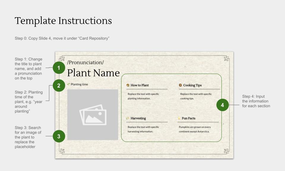
Since the crop cycle changes regularly, creating new information cards each time is impractical. So, we designed an editable template that allows farm staff to easily update and print new cards as needed.

Community Participation
We created a visual compost sorting guide to help volunteers navigate the compost pile independently, without relying on staff assistance
Compost Station Signs
The compost pile is a key daily activity at West Oakland Farm Park, but initially, they only had faded, printed instructions. To address this, we created a durable and clear sorting guide for both volunteers and staff.
IDEATION
03
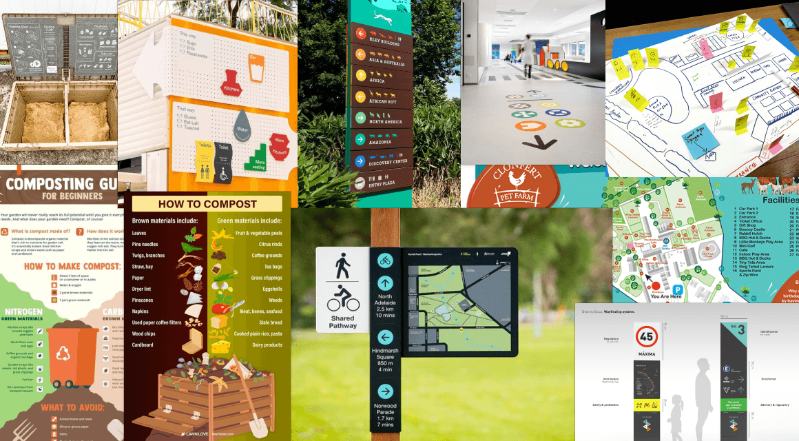
We took inspirations from different physical spaces to incorporate into our design system
Designing for physical space is particularly challenging as we do not just have to look at the digital designs, but how these designs come to reality as well as how users interact with it when it actually get implemented at the farm. Hence we took inspiration from various physical spaces
Bouldering Parks
The climbing paths are color-coded to help visitors easily distinguish and navigate them from other routes more clearly.
What we got: Color-coded areas and signs for easier understanding of the farm space
Residential Housing Complex
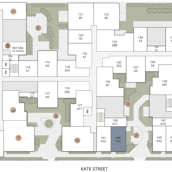
The housing complexes are like a labyrinth-without maps or clear signage, getting lost is easy. Simple, unobtrusive visuals can help visitors quickly navigate the space
What we got: Maintaining a minimalistic structure for the wayfinding map, with simple and clean shapes.
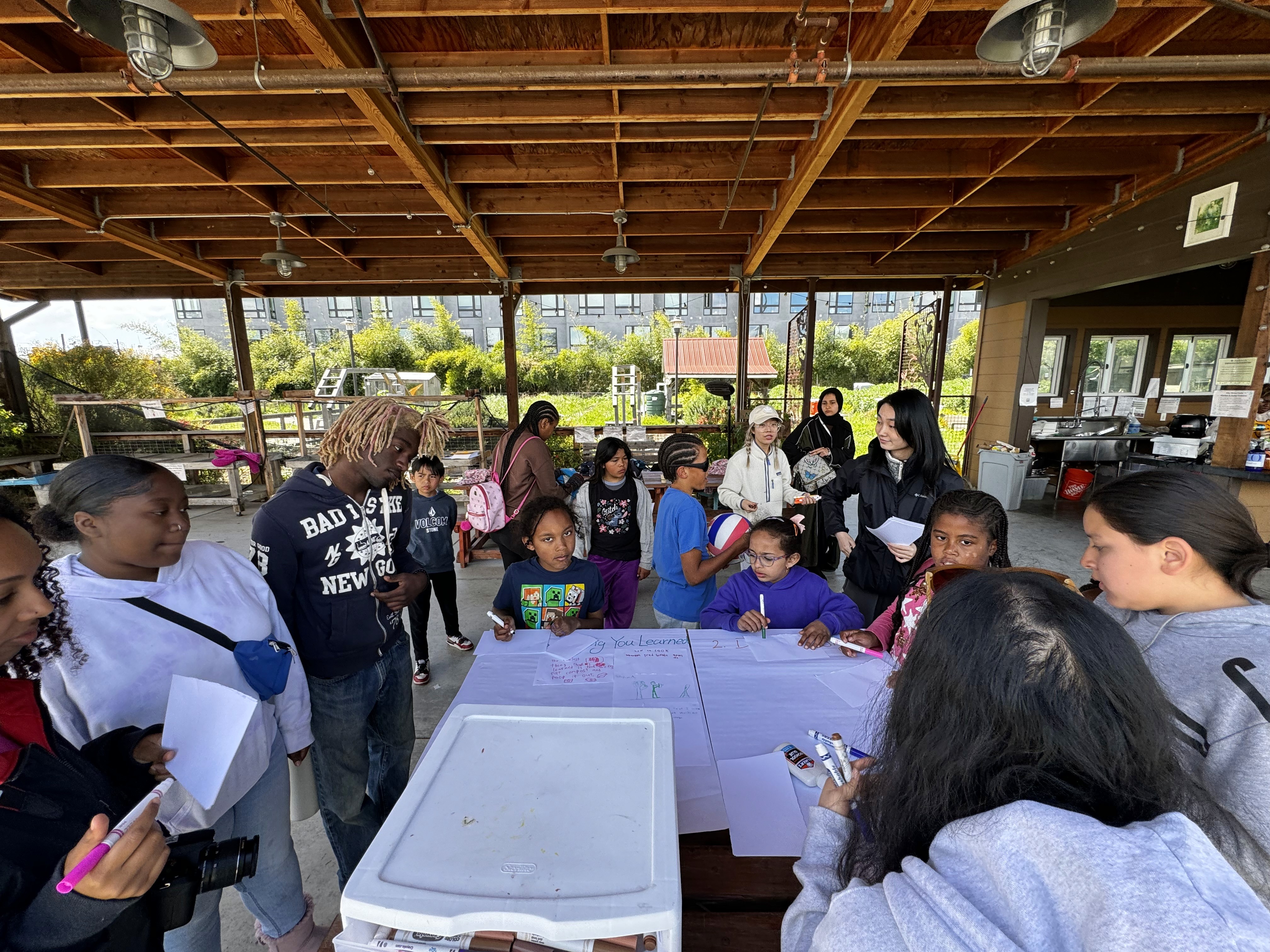
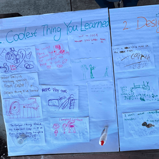
To understand more about what the kids expect to learn from the urban farm space, we conducted a drawing workshop with the camp kids
We facilitated a drawing activity with children at Acta Non Verba's occasional camp at West Oakland Farm Park. This helped us gain deeper insights into what they currently learn from the farm, their motivations, challenges, and expectations—whether it's green education or life skills development.
What we got: The kids expressed a desire to learn more practical applications of what they interact with, such as how to use the farm's produce to prepare meals and incorporate it into their daily lives.
Brainstorming and Moodboarding for Designing
for Physical Spaces
PROTOTYPING & DESIGN DECISIONS
04
Let’s walk through the design process and key decisions that shaped our final solution

Wayfinding
Wayfinding Farm Map
Version 0.0
This is the current map of the farm, created back when the farm park was under the stewardship of City Slicker Farms, before Acta Non Verba took over
Current Challenges:
- Outdated information
- Difficulty in navigating the space due to incorrect representation of different areas
- No consistent design language
Version 1.0
We used business origami to map out the different areas of the farm, guided by staff members and supported by photos and videos from our field visits. We also identified which stakeholders interacted with specific spaces within the farm.
Version 2.0
We refined the low-fidelity wireframes, adding clear boundaries and 3D elements to make the map more engaging and accessible, especially for kids visiting the farm.
Feedback from the Usability Test:
- Visitors & staff really liked the 3D illustrations which made the map more engaging & accessible
- Easy to understand & differentiate areas on the farm
- Missing or incorrect information with respect to different areas of the farm space
- Text was not readable from a distance
Version 3.0
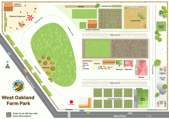
Based on feedback from our last usability test, we added missing data, used Google Earth & drone images to create a to-scale farm map, ensuring seamless navigation. We also highlighted key text and added a QR code linking to the website to boost community participation and awareness.
Feedback from the Usability Test:
- The staff & visitors appreciated the clear structure and fun design language for the new map
- Positive response on text legibility
- Participants found the map a little too crowded with all the 3D elements & different colors
Final Wayfinding Farm Map Design
Color Coded Areas
We separated the farm space into different colors based on different functions
Community Awareness
We added basic farm information and their Instagram account to build community bonds and keep everyone connected with ANV
Simplified Illustrations
We simplified all graphic elements to ensure a pleasant, uncrowded design
Coherence
Using minimal colors to give it a uniform and clean look. Added wooden textured background to make it seamless with the station
Directional Signage
We opted for a minimal design for the signs to enhance legibility and accessibility, carefully selecting the most strategic locations to place them while working within a tight budget
From our usability tests, we gathered feedback on the visual design, legibility, and size for the final prints. Visitors responded positively to the simple yet clear designs, and they appreciated the use of symbols for accessibility. We also tested different placements to determine the most effective locations for the signs. Using those insights, we narrowed it down to the minimum number of placements, prioritizing proximity and ease of navigation. Due to budget constraints related to printing and setup costs, we had to limit the number of signs to only what was absolutely necessary

Learning
Species Information Card Template
We gathered insights from staff, kids, and adult visitors about their learning expectations and narrowed it down to basic planting information, practical applications, and fun facts
We collected all the insights from staff, visitors (via intercept interviews), and children at ANV camps (ages 3-13, through a drawing workshop) about their learning expectations from the farm. We narrowed it down to basic planting information, and practical applications, and, as voted by staff and camp facilitators, we chose cooking tips for the first draft of designs and of course some fun facts to keep curiosity alive across all ages.
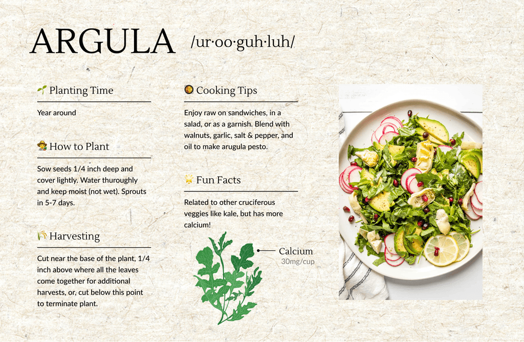
Proposal 1
In this info card design option, we focused not only on the key information but also included images of dishes made from the produce to increase relevancy
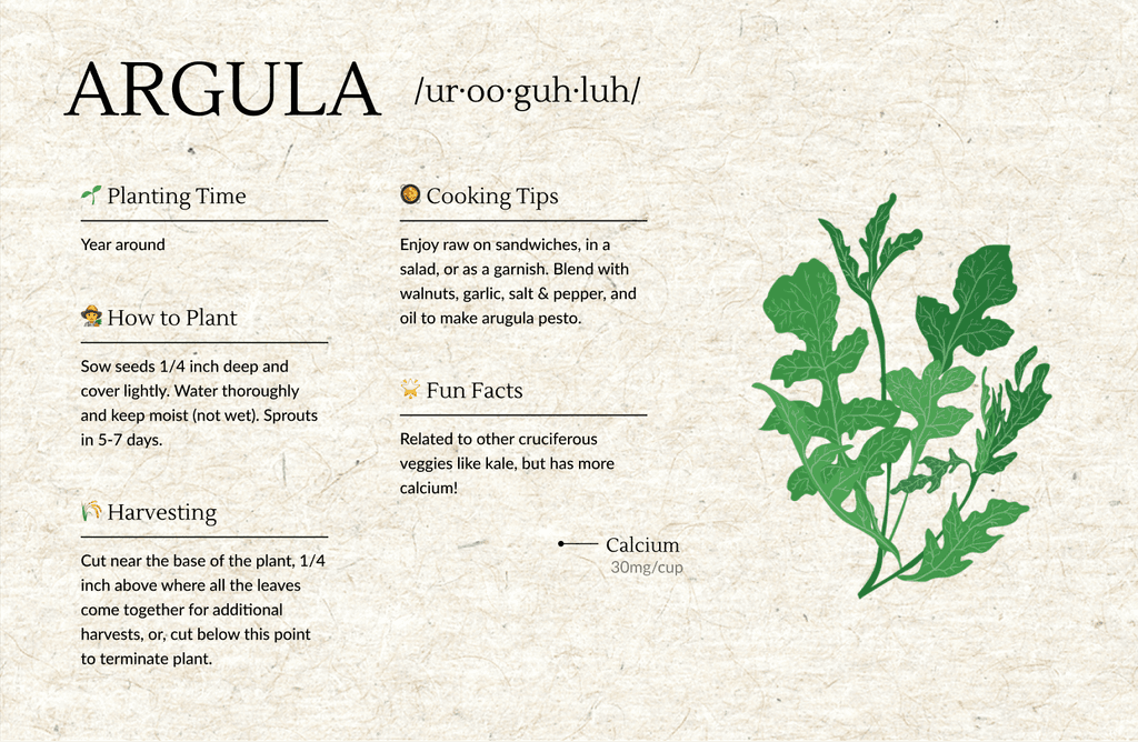
Proposal 2
In this option, we focused on the images of the plant leaves so that it is easier for the audience to recognize the plant and match it with the rest of the informtion
Proposal 3
This option is similar to the second proposal in terms of the information displayed, but the layout and design are more playful and ornamented to capture the attention of both kids and adult farm visitors.
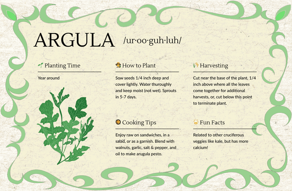
Final Specie Information Card Design
Planting Information
The farm staff want visitors to learn the basics of urban farming practices and trying them at home.
Practical Application
Including daily uses of these plants, such as cooking tips, helps educate kids on how fresh produce can be utilized in various ways
Clear Imagery
Clear, real images of the plants are included to make it easier to recognize the species being discussed.
Fun Facts
Some interesting or not so known fact to maintain curiosity amongst users of all ages
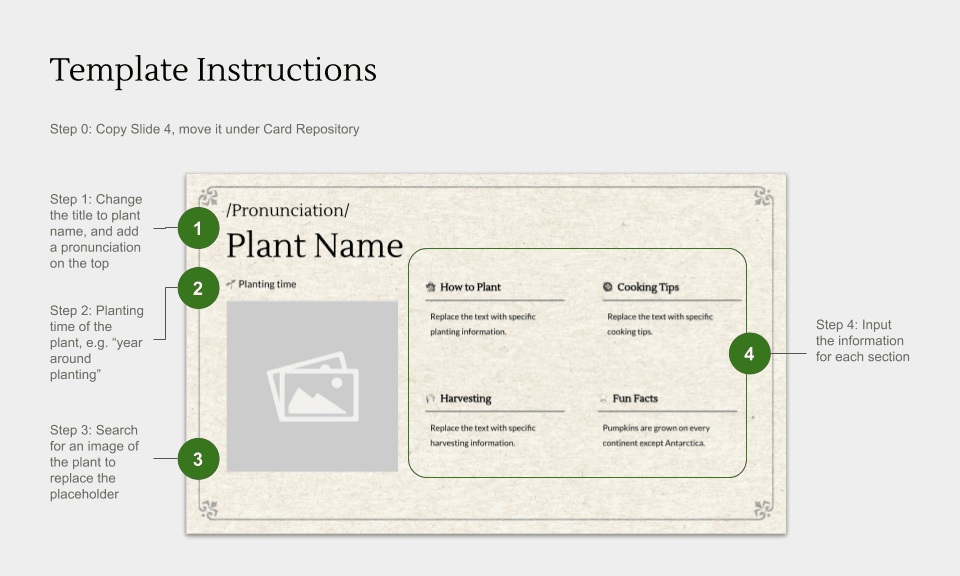
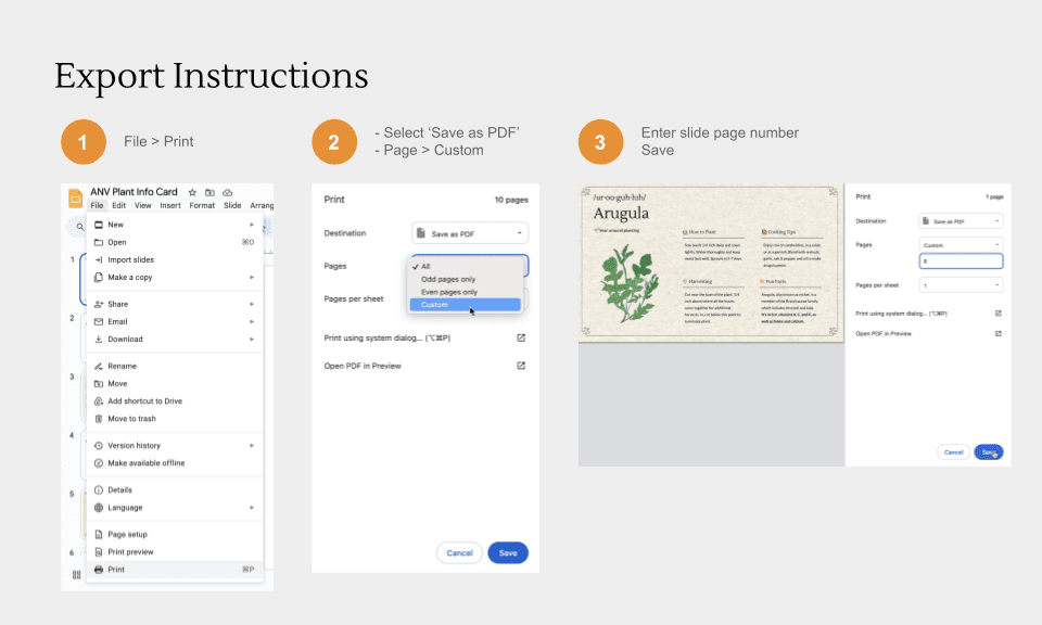
Editable Template & How to Use Guide
We then converted the final design into an editable template on Google Slides for the farm staff to modify content for different species without the knowledge of any complex design softwares
We wanted the solution to be flexible, allowing the farm staff to easily create new information cards for any species as needed. Since the list of species changes with the seasons, the farm requires the ability to produce similar cards without our assistance. By following the user guide, staff can simply duplicate the template, update the content, and print the new cards, ensuring they're prepared for any changes

Community Participation
Compost Station Signs
Version 0.0
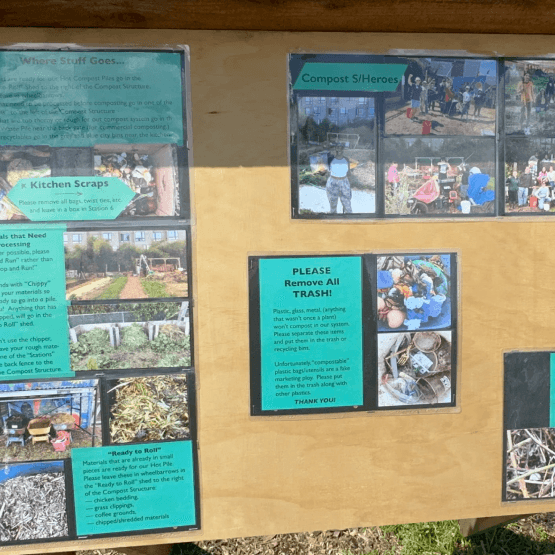
These are the current instructions for the compost pile, used by farm staff, volunteers, and community members to properly segregate waste for composting
Current Challenges:
- Bad quality images
- Too much descriptive text to read before sorting
- No hierarchy of steps that needs to be followed
- No directional signs to locate various bins
Version 1.0
Based on the necessary information for segregation of waste which we got from Susan, the compost pile specialist, we curated the first version of design based on a bento box design method
Feedback from the Usability Test:
- Some information had to be revised as per Susan, the compost pile facilitator
- Some cards were supposed to be moved to a different location due to the expansion of the compost area
- Workflow was confusing
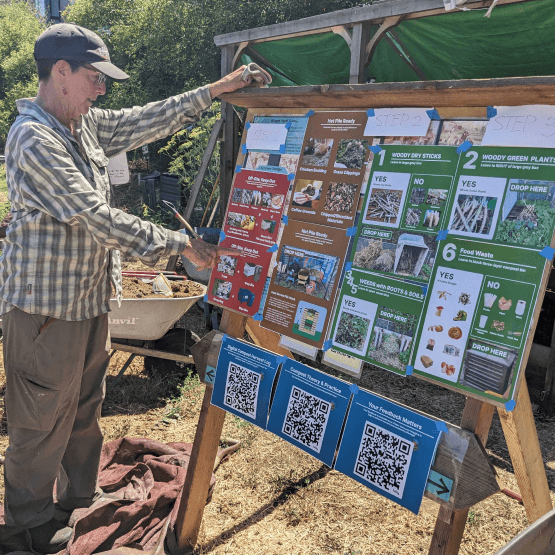
Final Main Compost Station Signs
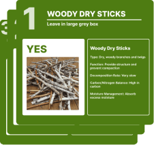
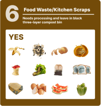
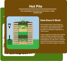
Detailed signage for each station
Clear Workflow
Step by step workflow for an ease to follow the instruction independently
Color Coded Steps
Use distinct colors to visually differentiate waste streams. For example, red for discard, green for slow compost, brown for quick compost
Digital Managerial Resource
Digital repository using QR code for compost harvest log, more educational material as well as feedback form
IMPLEMENTATION PLAN
05
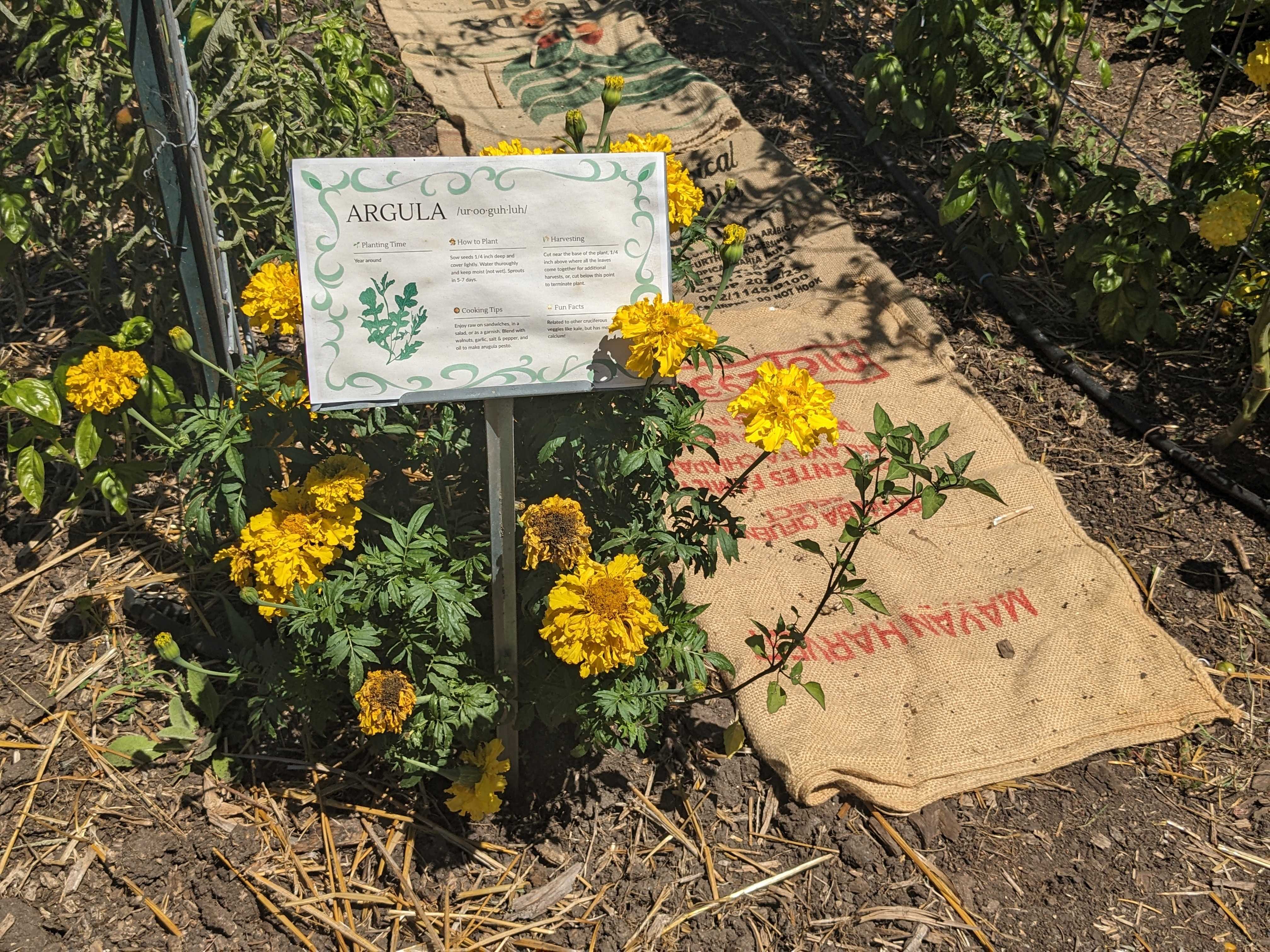
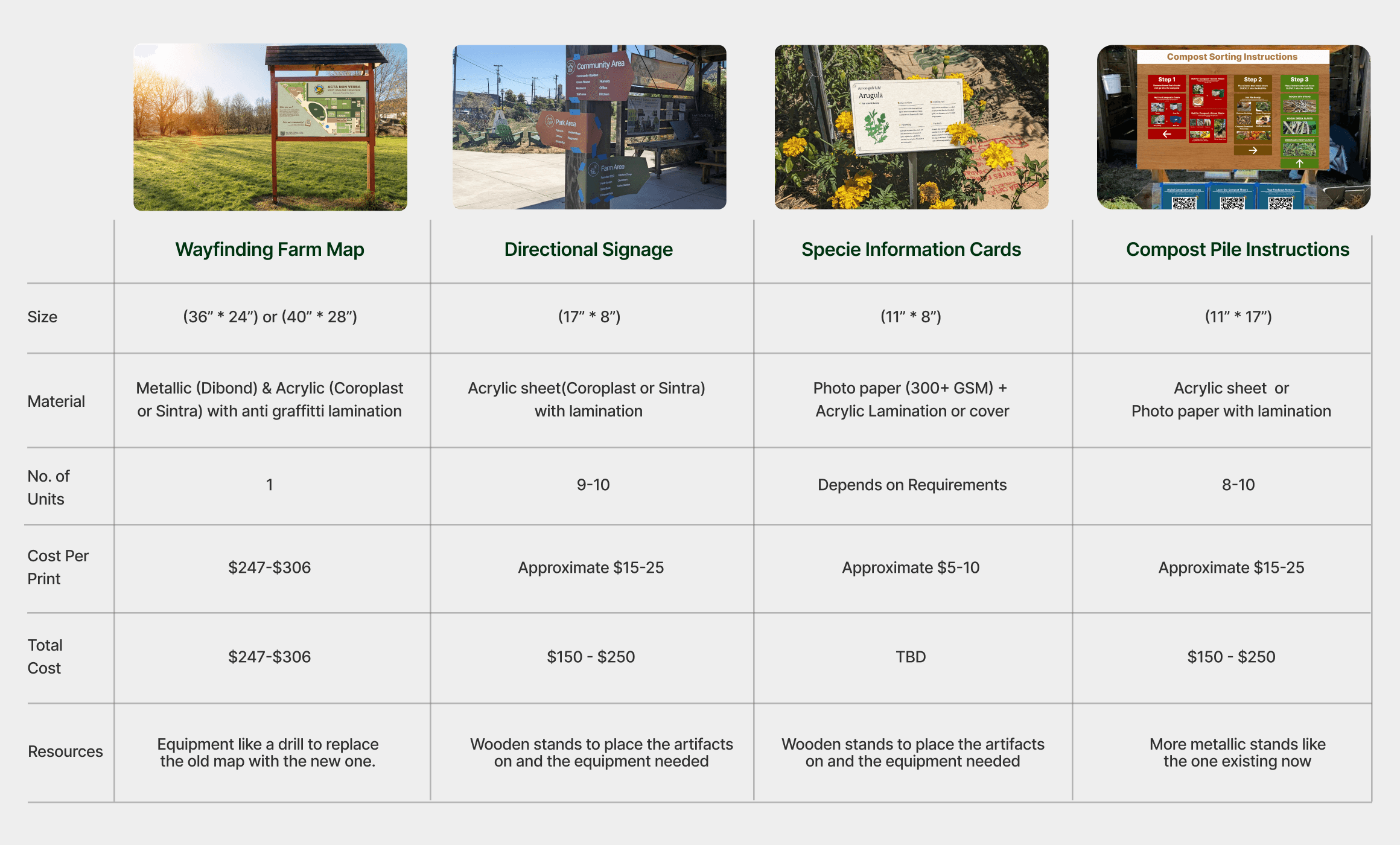
To ensure practical implementation, we prioritized design feasibility within Oakland's farm space, considering budget and space constraints. Our outdoor designs incorporate weather-resistant materials and anti-graffiti laminates to withstand the harsh elements of the Oakland climate
HAND OVER
06
We finally created a Google drive link containing all the printable design PDFs, as well as all the necessary links to the template, instructional guide & the implementation plan
FUTURE VISION
06

Community Participation
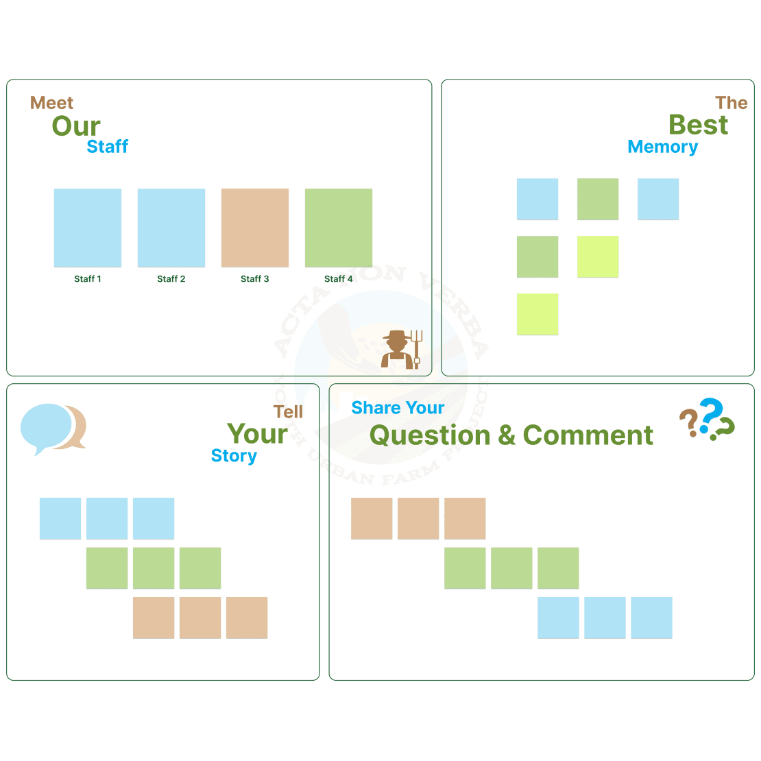
Community Board
Develop a space that encourages visitors to learn, share, and connect with the farm's mission and community

Learning
Scavenger Hunt
An interactive and fun activity for kids to learn more about urban farming as well as explore the farm space.
LEARNINGS & REFLECTIONS
06
We improved the experience of each visitor & volunteer at the farm space, by helping them to get familiar with the farm space as well as different urban farming practices.
Created a wayfinding system for a 1.4-acre urban farm park in West Oakland
Created informational resources for the farm produce as well as a template for the staff to produce fresh content with a similar design constantly
Created a set of clear instructional guides for the volunteers and visitors to properly segregate waste to be put in the compost pile
My Learnings
Our farm project was a unique challenge that pushed me to grow as a designer. I learned the ins and outs of outdoor design, balancing creativity with practicality while considering the diverse needs of our audience.
One of the biggest challenges was working within budget constraints without compromising the design’s impact. We had to be strategic about material choices and prioritize features that would deliver the most value.
It was incredibly rewarding to see our designs come to life and positively impact the farm experience. This project helped me develop a stronger understanding of the intersection between design, practicality, and business goals.
