
B2B SaaS
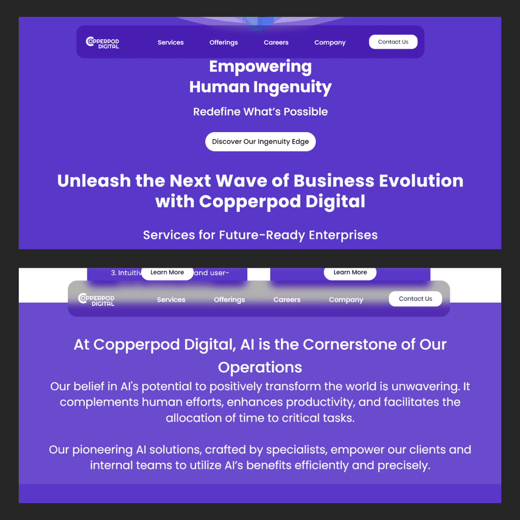
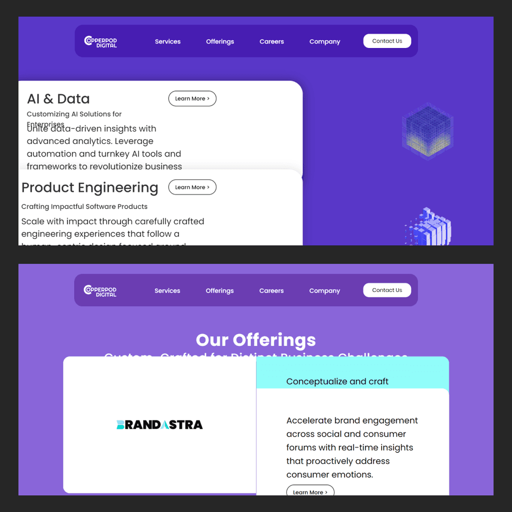
Copperpod Digital: Brand Reposition & Website Design
Implemented a complete end to end redesign & development of their digital presence to improve their complete user experience, data visualization and aesthetic appeal

Figma, Photoshop, Illustrator, Wix Studio
80%
60%
25%
increase in user engagement
UNDERSTANDING THE CHALLENGE
01
Copperpod wanted to revamp their digital presence with a fresher brand positioning as pioneers in product engineering leveraging an AI-first approach
The existing website and brand position are targeted towards Global Capability Centers (GCCs). Their team did not like the current website and had discovered that it lacked engagement and were having trouble in communicating the key information to the target audiences. Their goal is to reposition as pioneers in product engineering, leveraging an AI-first approach to deliver accelerated business solutions and drive ROI. Additionally, visual and navigational issues have been affecting the overall user experience.
There were some constraints from the client side which we had to take in consideration while working on the solution
We were up against a tight deadline to launch a fresh website before their major international event in Milan.
We used Wix Studio since they had an existing subscription, but this came with limitations, especially when designing dynamic features
RESEARCH & ANALYSIS
02
Understanding the brand and what do they do!
Before diving into the design process, I took the time to understand the brand on a deeper level. I had a call with the project lead to get insights on their unique selling points, the key services they wanted to highlight, and their mission and vision. We also discussed the challenges they were facing and who they were targeting with their newly repositioned digital presence.
Heuristic Analysis
To quickly identify the usability issues on the current website, I did a thorough heuristic analysis
Given the tight deadlines, we had limited time to conduct comprehensive user testing on the current website to uncover usability and interaction issues. To save time, I applied agile methodologies and performed a heuristic analysis to quickly identify key usability challenges and offer targeted recommendations for improvement.
Aesthetic & Minimal Design
Poor text hierarchy and insufficient spacing between sections and text boxes made it difficult to focus on the content.
There's just too much content on a single page, which makes the website feel cluttered and overwhelming to navigate.
The high contrast of the background makes it hard to focus on the text.
Flexibility & Efficiency
of Use
The site’s information architecture is confusing, which makes it tough for users to navigate.
- There are quite a few glitches during the scrolling animation, which really slows down the website's performance.
IDEATION
03
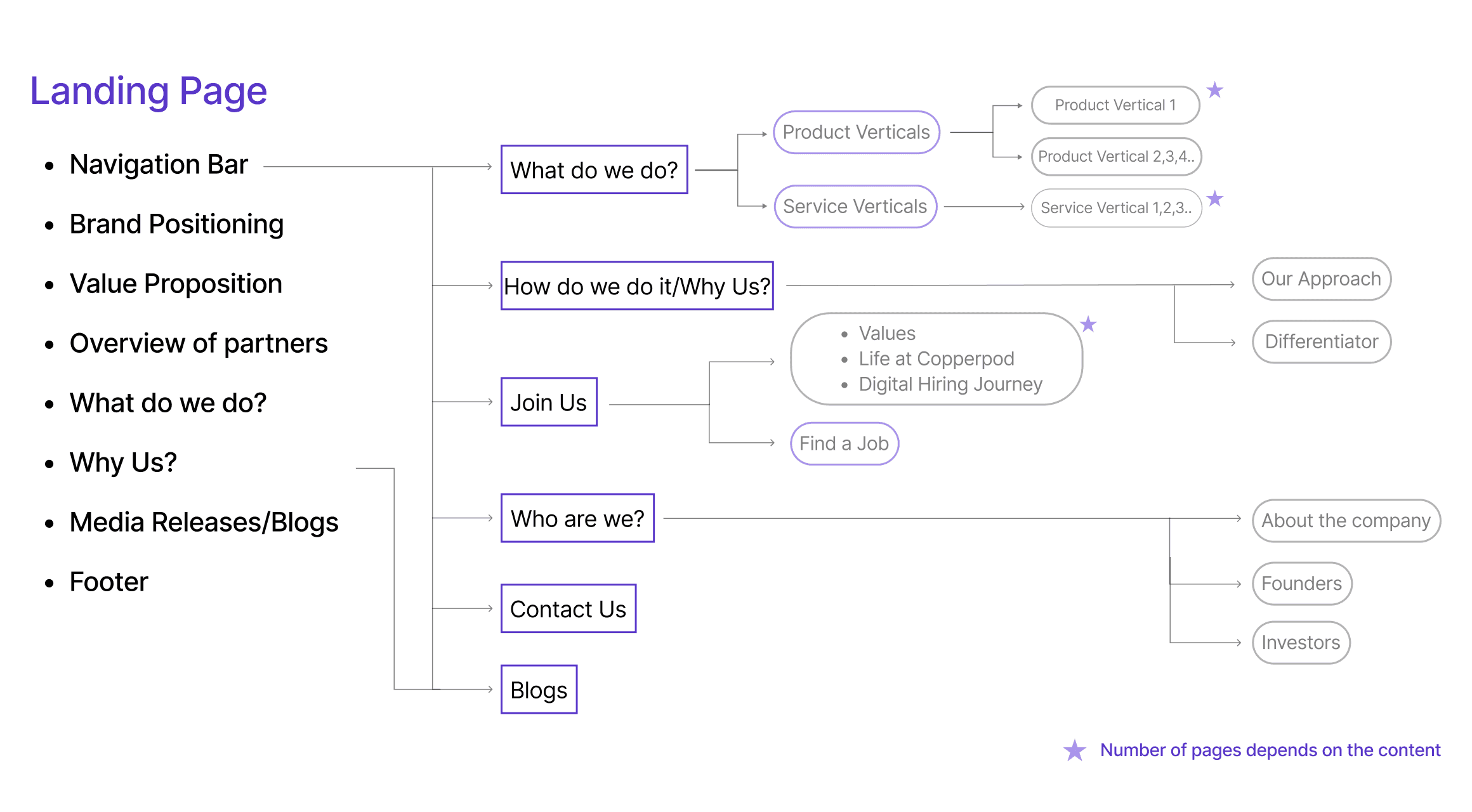
Information Architecture
Crafting a User-Centric Information Architecture to Highlight Key Services and Brand's Value Propositions
I mapped out the website's information architecture to optimize user experience and visibility, focusing on the services, value propositions, and story, as we discussed during the briefing call with the project lead. I structured the flow of the content with both business needs and user experience in mind. Then, I collaborated with the content team to develop detailed information for each section I outlined.
The information architecture helped the content team to frame copies as per the flow of the user to maintain a seamless flow and storyline throughout the website
PROTOTYPING
04
Low Fidelity Wireframes
Created low-fidelity wireframes with a rough content guide to help the team streamline and organize the website content.
PROTOTYPING
05
Low-Fidelity Sketches
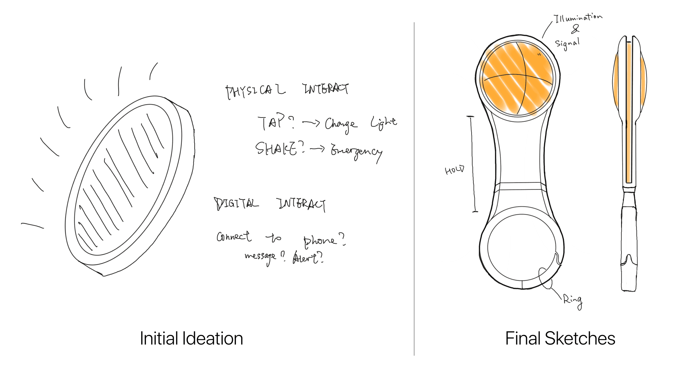
Designing a physical product that serves as both an illumination device and a warning & support tool
We brainstormed various product designs through rough sketches, prioritizing ease of use, ergonomics, and portability. We also explored physical interactions and feedback mechanisms, incorporating a simple lighting system to serve as both a warning and support tool
Low-Fidelity Wireframes
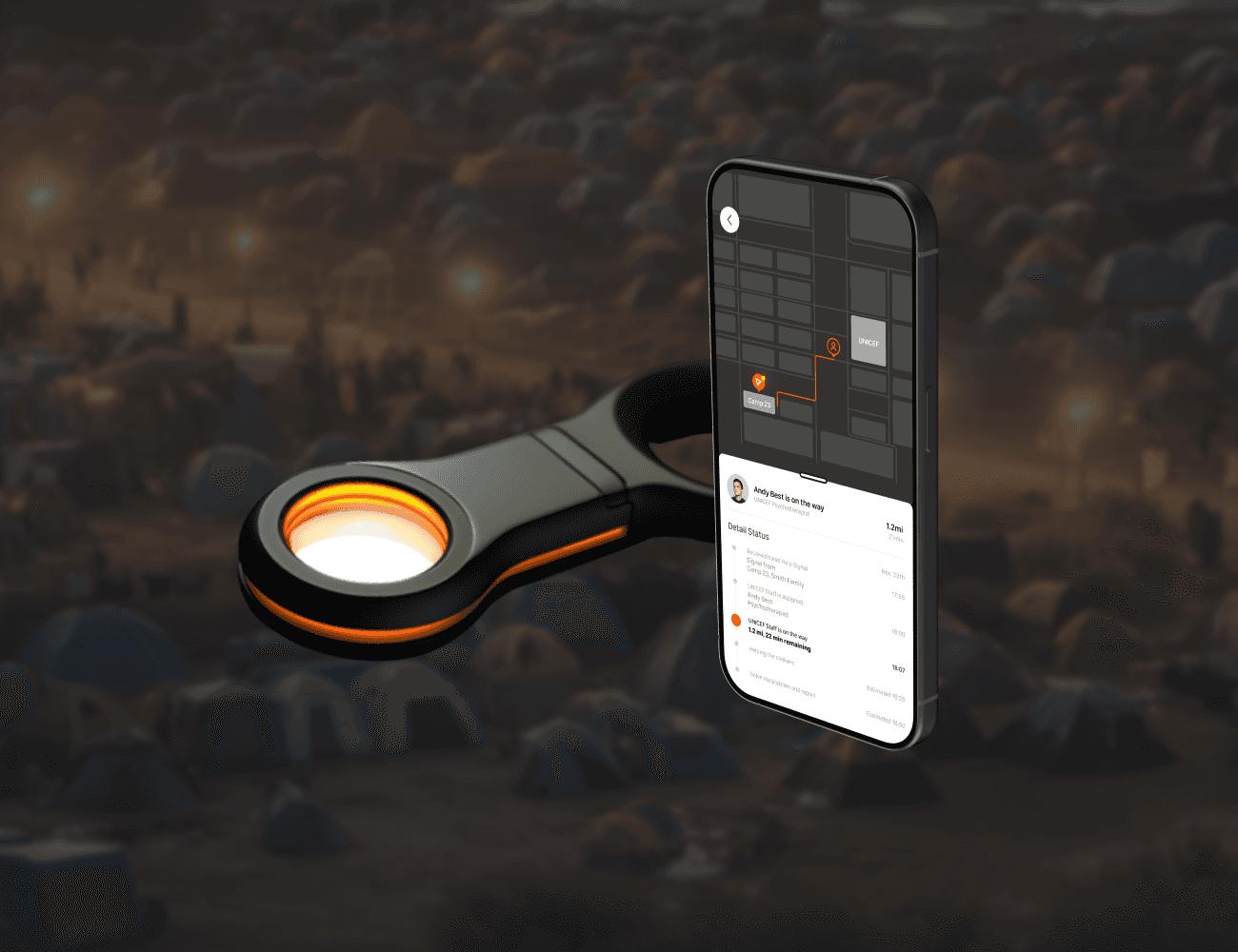
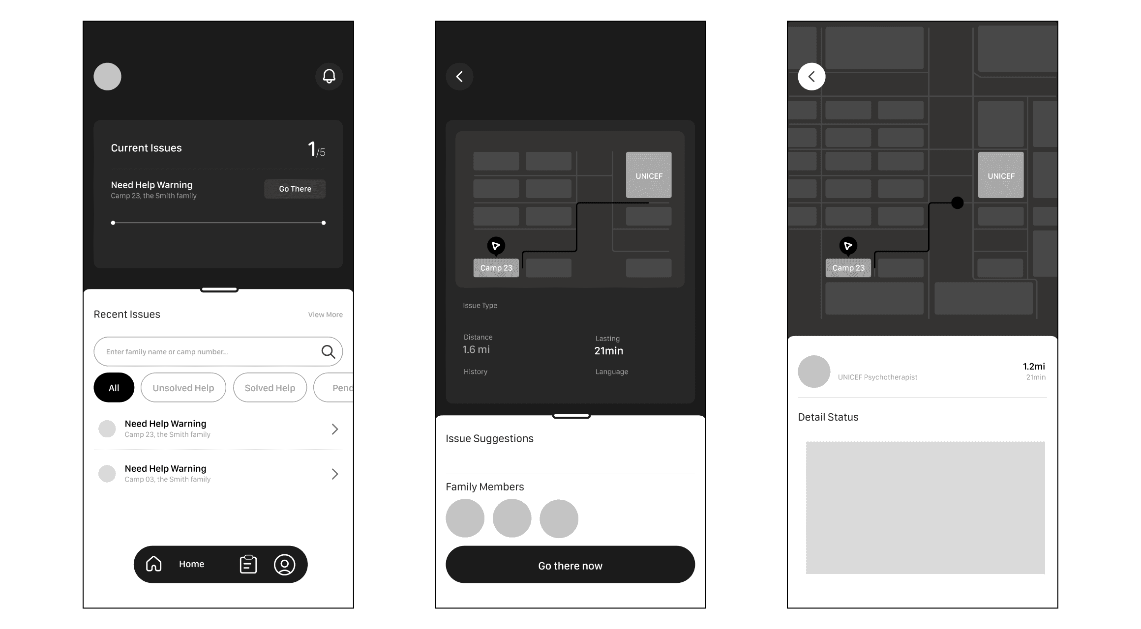
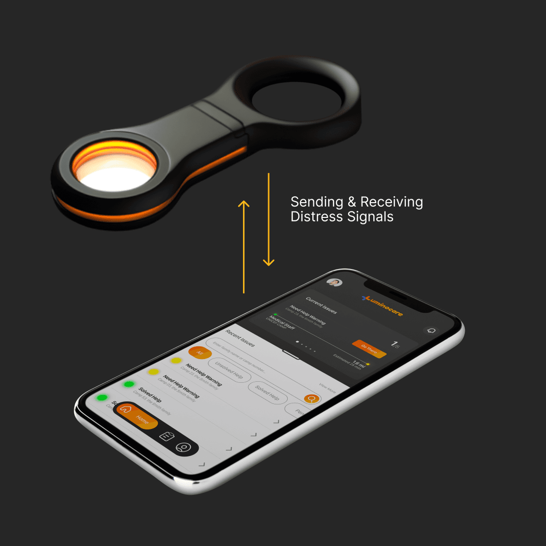
A connected mobile app for humanitarian organizations to provide faster aid by tracking the signal from the physical device
To complete the system, we integrated the physical product with a mobile application for humanitarian organizations. The app's primary function is to receive warning signals from the device and guide teams to the signal's location.
SOLUTION
06
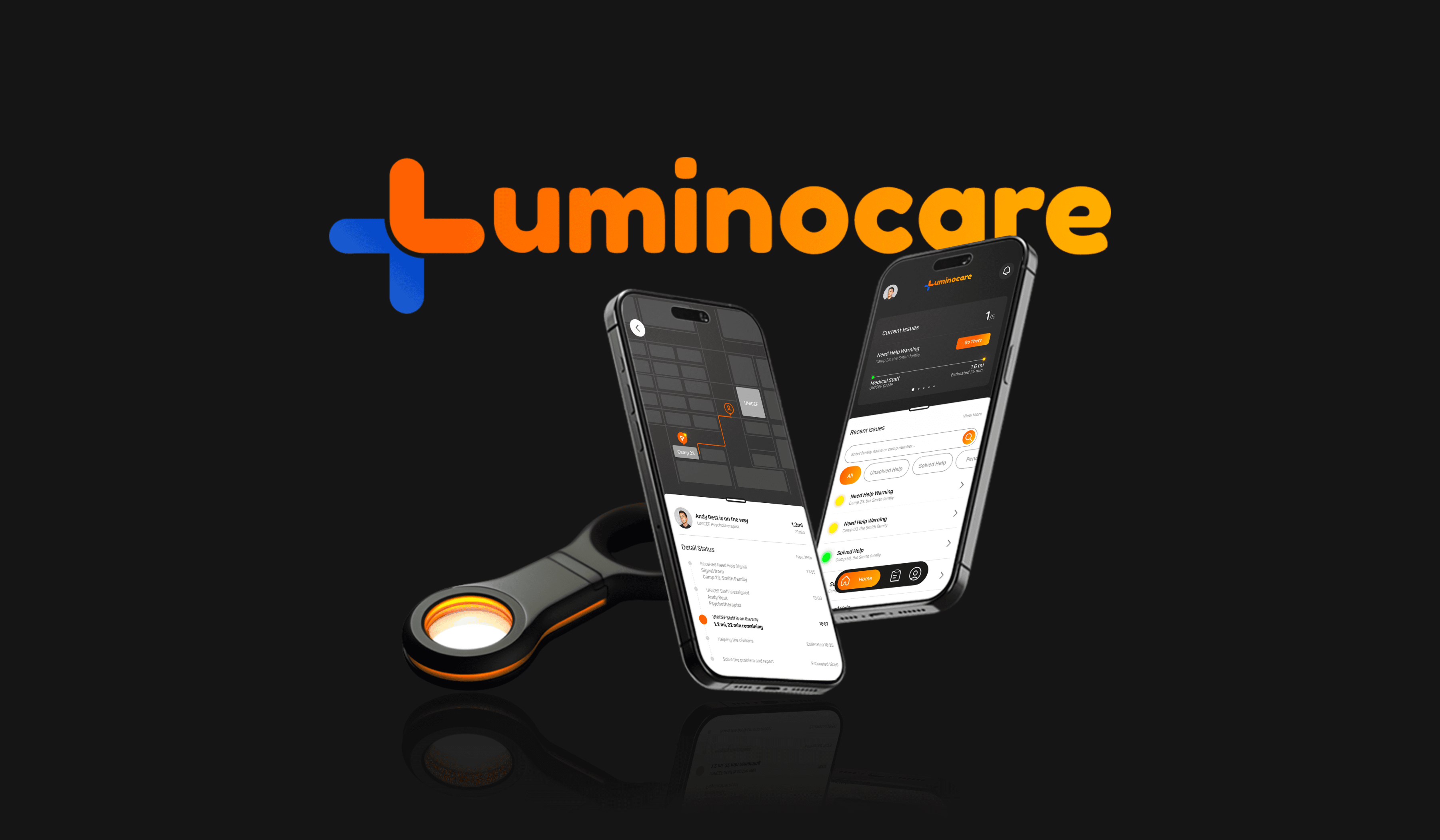
Luminocare: A Safety and Illumination Solution for Displaced Civilians
Luminocare is a product-service solution designed for displaced civilians in humanitarian shelters. It serves as both an illumination and alert device, connecting the community with shelter management during emergencies. By providing immediate support, it fosters a sense of safety and helps alleviate stress within the community.
Mapping the Design System
We mapped out the product service ecology to represent the user experience of a displaced individual living in humanitarian shelters, and how the physical device is connected to the management app which acts as a digital twin.

Detailed Solution
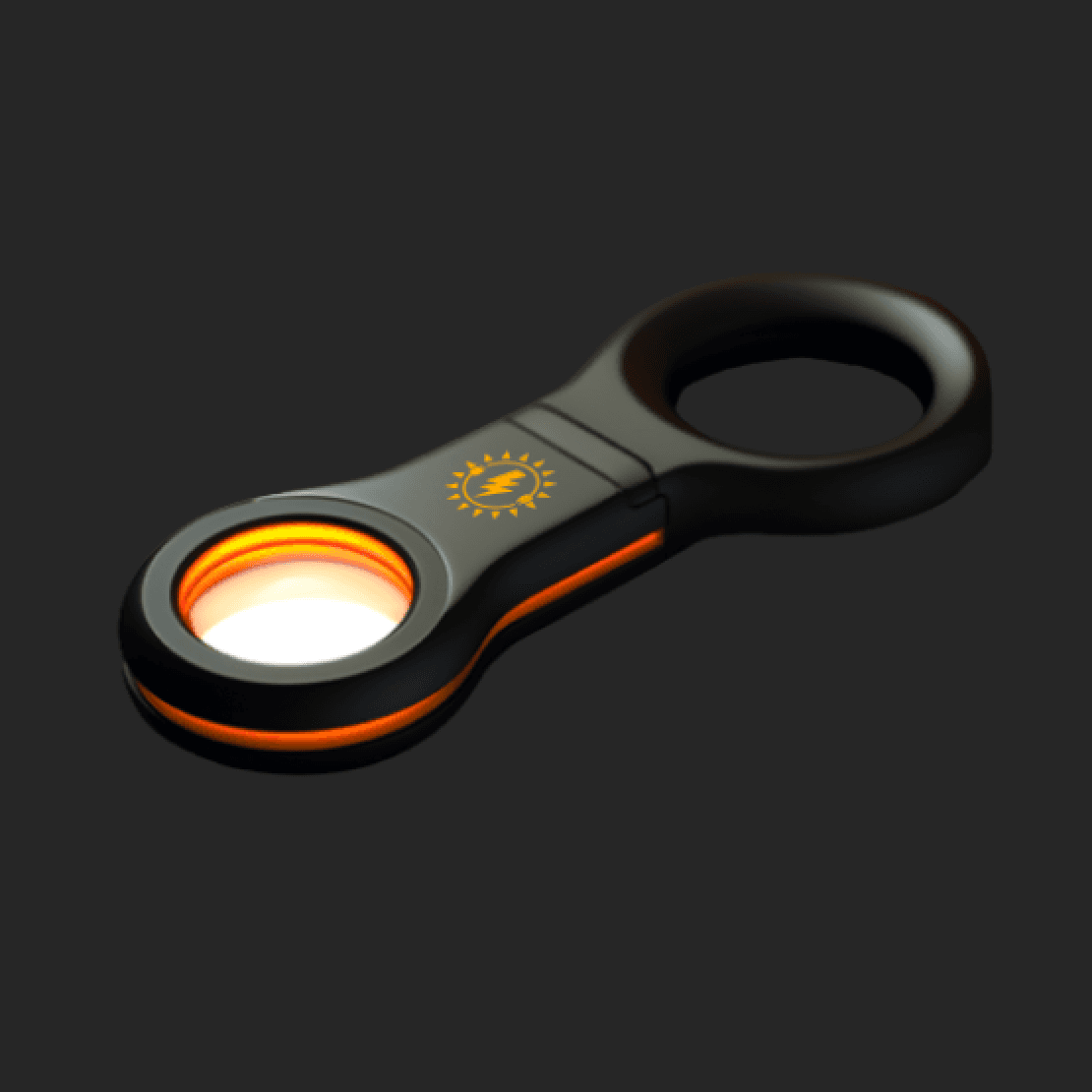
The key features of the Luminocare physical device
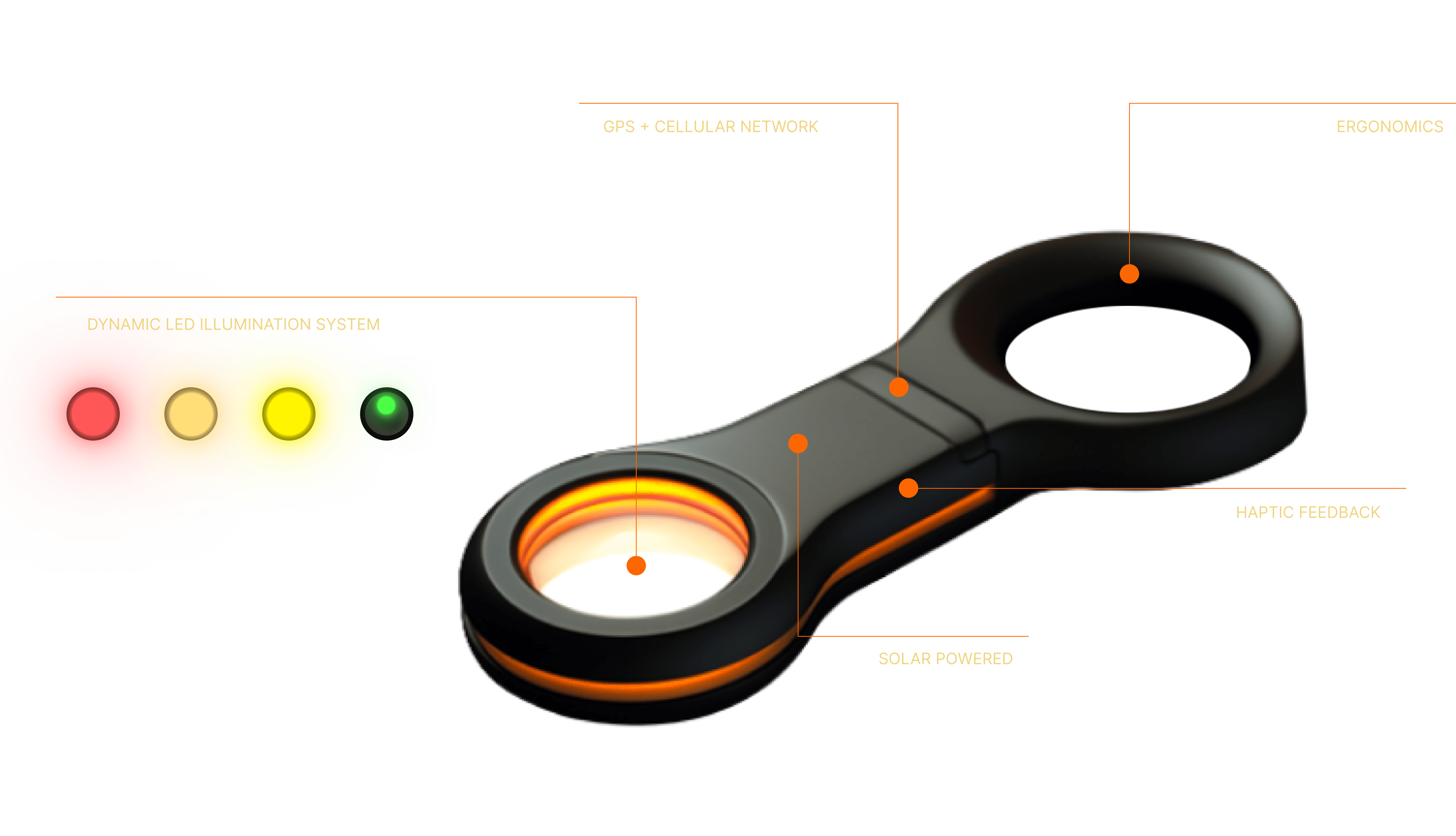
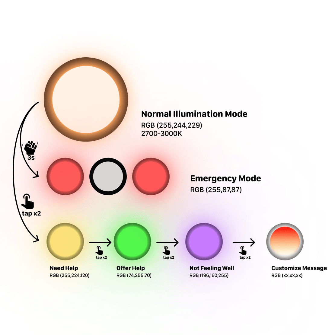
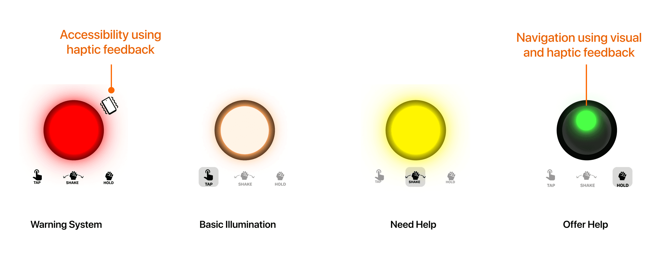
Dynamic LED Illumination System
Basic Illumination
LuminoCare provides a steady white light for everyday use, especially in low-light conditions. This feature helps users navigate and find objects in the dark.
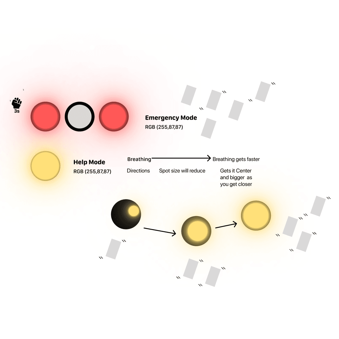
Help Seeking
The device emits a slow, pulsating yellow light when a user needs assistance. This rhythmic signal conveys urgency without causing panic, making it easily recognizable as a call for help.
Navigation
The device switches to a green light to help rescuers locate those in need. Its intensity, size and flashing frequency adjust based on proximity, aiding quick and efficient location
Emergency Warning
In critical situations, the device emits a flashing red light and strong vibrations to alert the user and nearby individuals of immediate danger. Grabs quick attention.
GPS + Cellular Network
LuminoCare integrates GPS and cellular technology for real-time location tracking and communication. It sends distress signals with precise location data to nearby help centers or emergency responders and keeps users connected with family and support networks, even in remote areas.
Solar Powered
Energy-efficient LEDs to maximize battery life. Its solar panel fully charges the device in 6 to 8 hours of direct sunlight, allowing up to 48 hours of operation. This makes it reliable and sustainable in areas with limited power access, ensuring dependable communication and safety.
Haptic Feedback
LuminoCare uses haptic feedback to discreetly alert users through vibrations, ensuring effective communication in noisy environments where auditory or visual alerts might be missed.

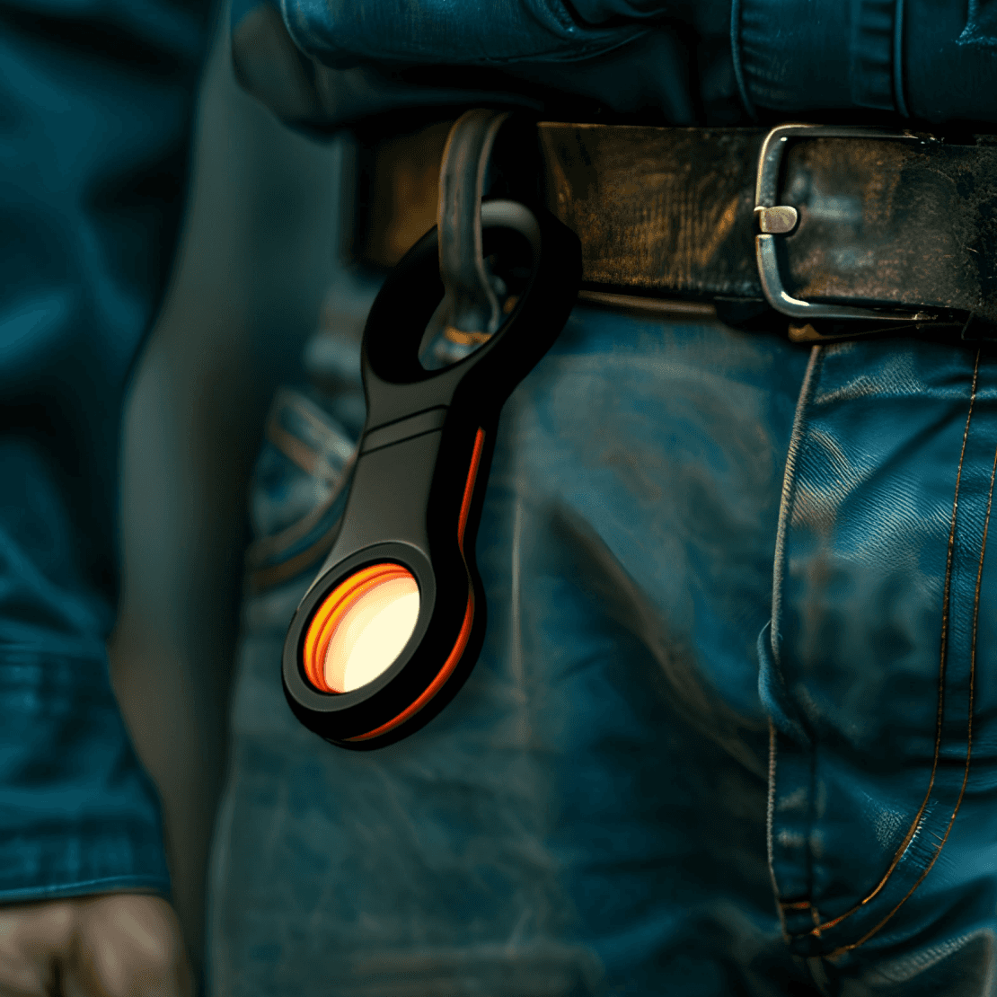
Ergonomics
LuminoCare is simple and easy to handle, with no buttons or screens. Lightweight and small, it features a finger hole for a secure grip or can be hung on a bag or clothing. Functions are activated by tapping the illumination area, ensuring intuitive use for all ages and abilities.
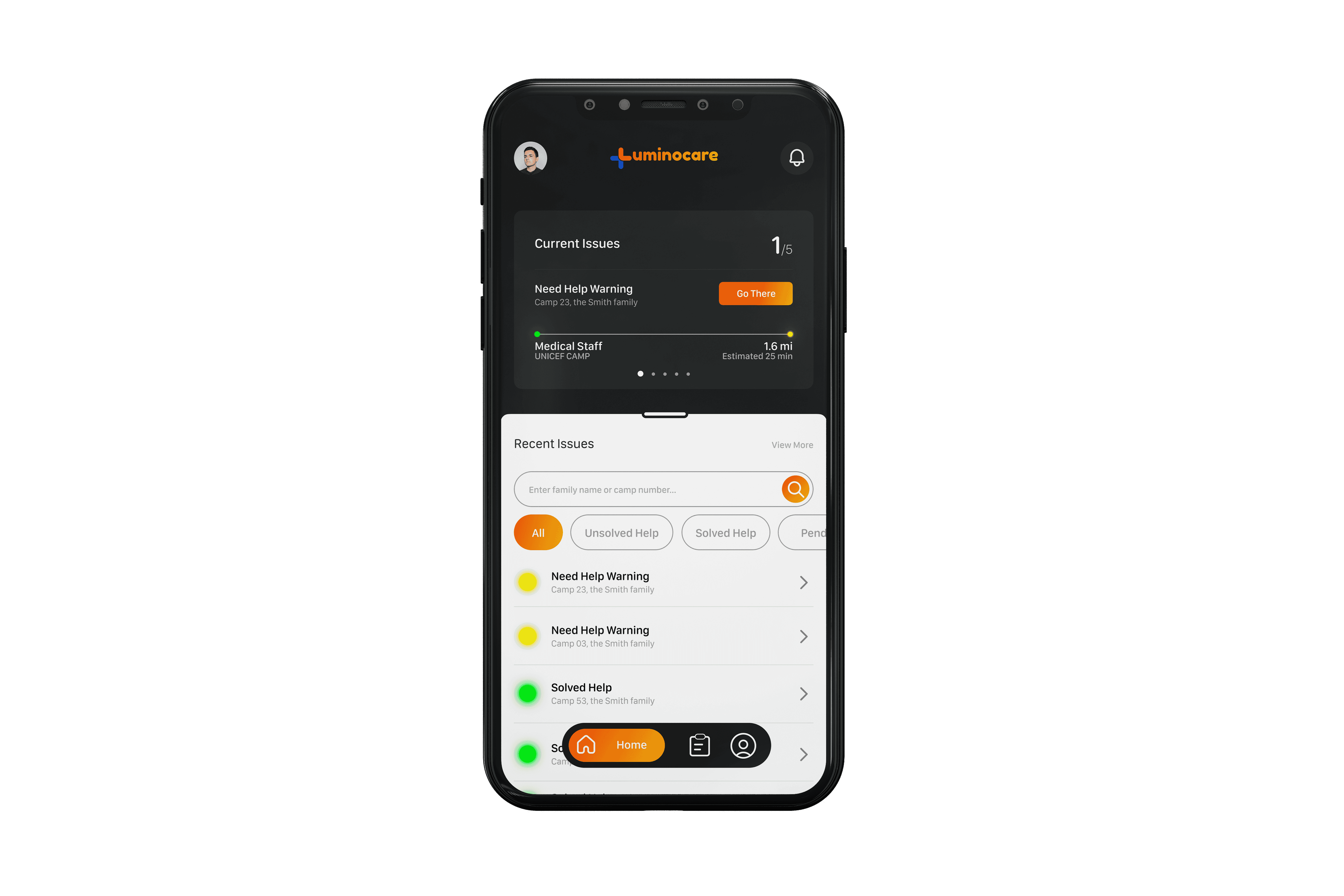
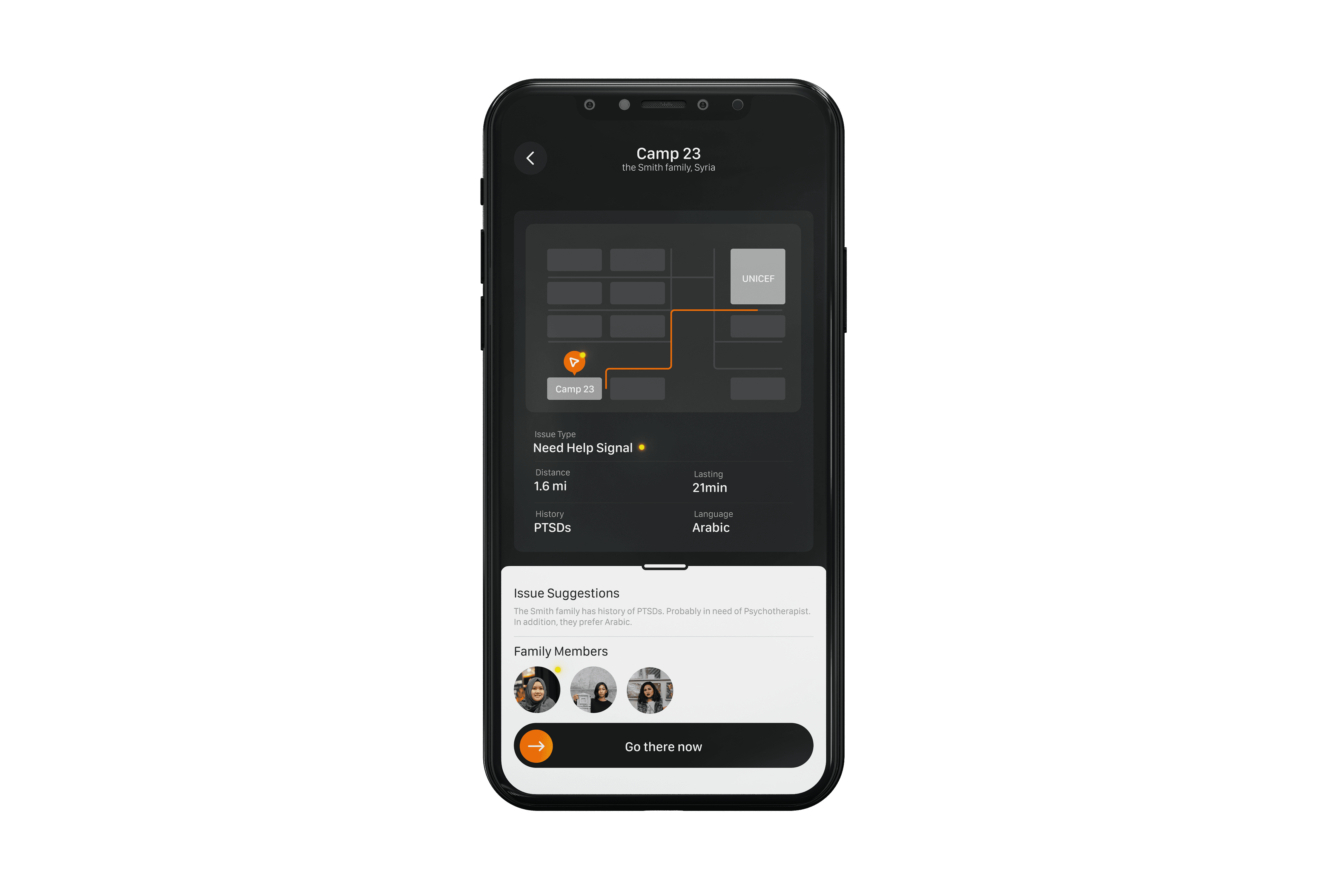
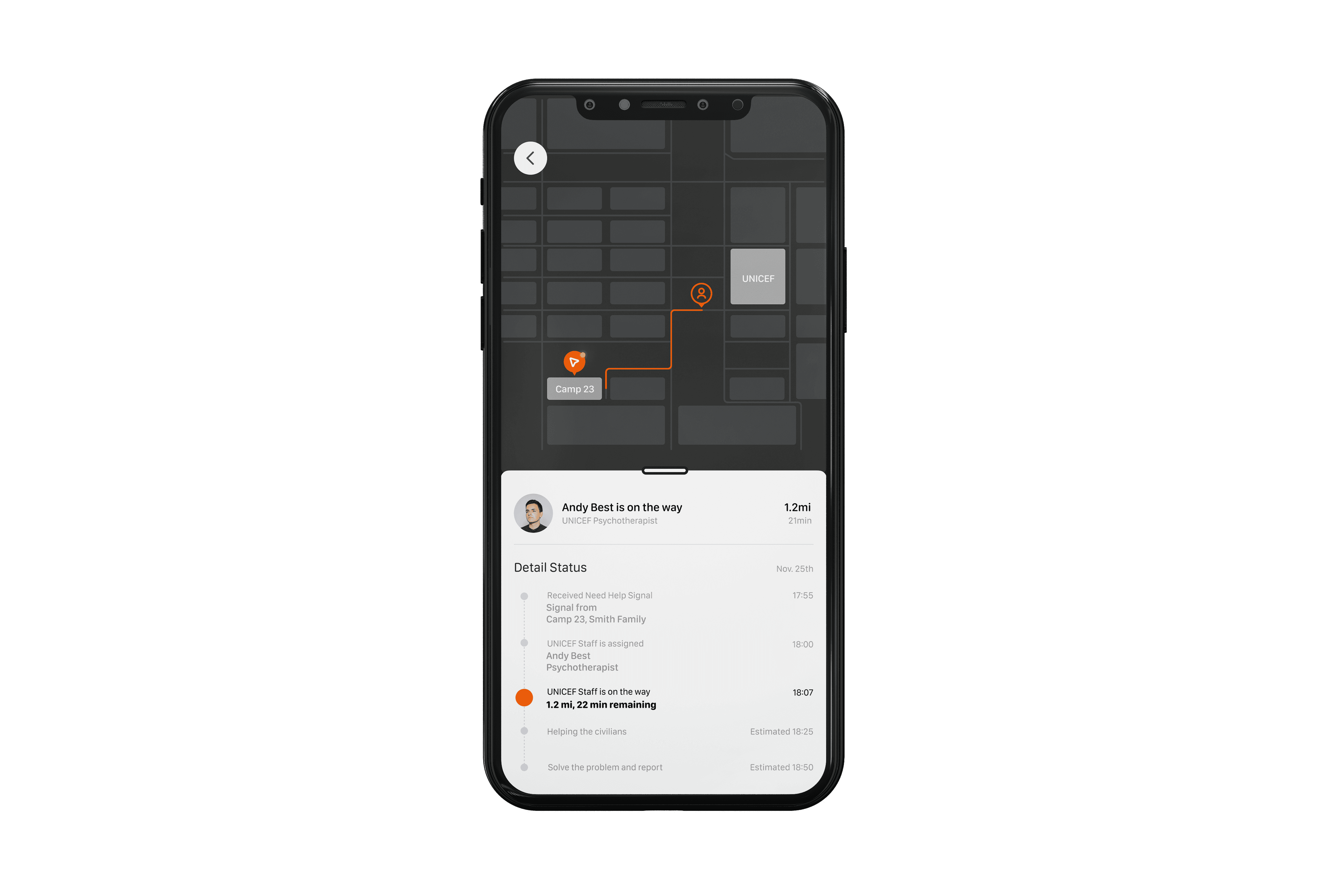
Humanitarian Application for Shelter Management
This management and tracking application for the shelter management. It gets real time data from any Luminocare device & informs the staff about the status of the civilians who are in the need of any assistance, and can track their location, enabling them to provide assistance as soon as possible.
DESIGN DECISIONS
07
Physical Device
Final design decisions prioritized ease of use, simplicity, and ergonomic handling
While exploring designs for the physical device, we focused on ergonomics, ensuring it was easy to carry and simple to use for anyone, regardless of age or education. The functionality had to be intuitive, allowing seamless use even in high-stress situations. We also kept production costs low ensure accessibility and wide distribution.

Aesthetic & Minimal design for ease of use & portability
Constrained features for less complex usage and increase in efficiency
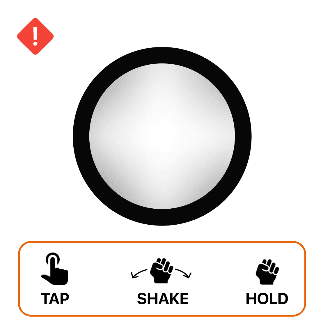
Warning System
Action: Haptic Feedback & Rapid Red Blinking
In emergencies, the device uses rapid light flashes and haptic feedback to quickly alert and ensure safety
Basic Illumination
Action: Tap
A simple tap gesture toggles the device’s illumination function on and off
Need Help
Action: Light Shaking
In case of help, lightly shaking the device signals for help, triggering a steady yellow pulse and notifying nearby devices.
Offer Help
Action: Long Hold
A simple long press on the device initiates navigation, automatically guiding civilians toward an alert triggered by any nearby device
FUTURE VISION
08
Next Steps
Physical Prototyping
3D printing to validate ergonomics
Usability testing to validate the technical feasability and other functionality
Partnerships
We would like to reach out to various organizations around the globe that provide assistance in disaster response, healthcare, and disaster preparedness.

Red Cross

UNESCO

International Rescue Committee

United Nations Office for the Coordination of Humanitarian Affairs
LEARNINGS & REFLECTIONS
09
Luminocare empowers humanitarian organizations to deliver aid more effectively, providing essential light and support to displaced civilians
It has reduced the response time for aid and support for internally displaced civilians.
Reduced fatalities
Stress Relief to the Displaced Individuals
Building trust & communication amongst communities
My Learnings
This project helped me to gain experience in terms of working with users who are difficult to talk to or are going through some mental stress. With the strict timelines in place, I learned a lot in terms of what steps and insights to prioritize using Googles design sprint as a framework to come up with a user friendly solution.